A different approach to savings…
Pocket Hero—
The fun savings companion for your next savings goal
No one likes budgeting; just like no one likes dieting. Both make us feel like we can’t do or get what we want. That’s why many people drop out of budgeting apps after a while.
And this is where Pocket Hero comes in. Pocket Hero helps people build healthy financial habits without making them feel like they can’t enjoy themselves. It works with human psychology through gamification to create a fun and accountable savings journey for everyone.
PROJECT OVERVIEW
Tool
Figma, Figjam, and Adobe Illustrator
Medium
Mobile application concept
Role
UI/UX designer, visual designer, and researcher
Timeline
6 weeks
KEY FEATURE HIGHLIGHTS
Feaure 1: Goal setting
Answer 4 simple questions to help set up your first savings goal
Feature 2: Customization
Your Hero is your savings companion. Customize your savings journey with them
Feature 3: Journey
Gamified check-ins with Hero to stay accountable and celebrate when your goal is achieved
Okay, let us dig deeper into how Pocket Hero came about.
THE CHALLENGE
74% of millennials said they are at least somewhat stressed about managing their finances.
-2022 Investopedia Survey
Compared to generations past, It has become increasingly difficult for today’s young adults to make ends meet, let alone build wealth.
-The Emerging Millennial Wealth Gap, 2019
PROBLEM STATEMENT
How might we create a savings experience that sets users on the right path to becoming financially healthy and reduces stress?
THE APPROACH
Discover
With the challenge and problem statement in mind, I dove deeper into the problem space using the following three research methodologies.
User interviews
Competitive analysis
White paper research
USER INTERVIEWS
direct access to users’ perspectives + understanding users’ needs
I conducted a total of 6 interviews with participants aged 26 to 39. These participants are either currently using one or more budgeting tools or have used them in the past.
I took notes during the interviews and analyzed my notes later by color-coding each interviewee as shown in the figure below.
I then grouped similar notes together to find an underlying theme. From here, using the qualitative data points I collected, I also created an empathy map to help me better the user perspective. You can see my thematic analysis and empathy map below.
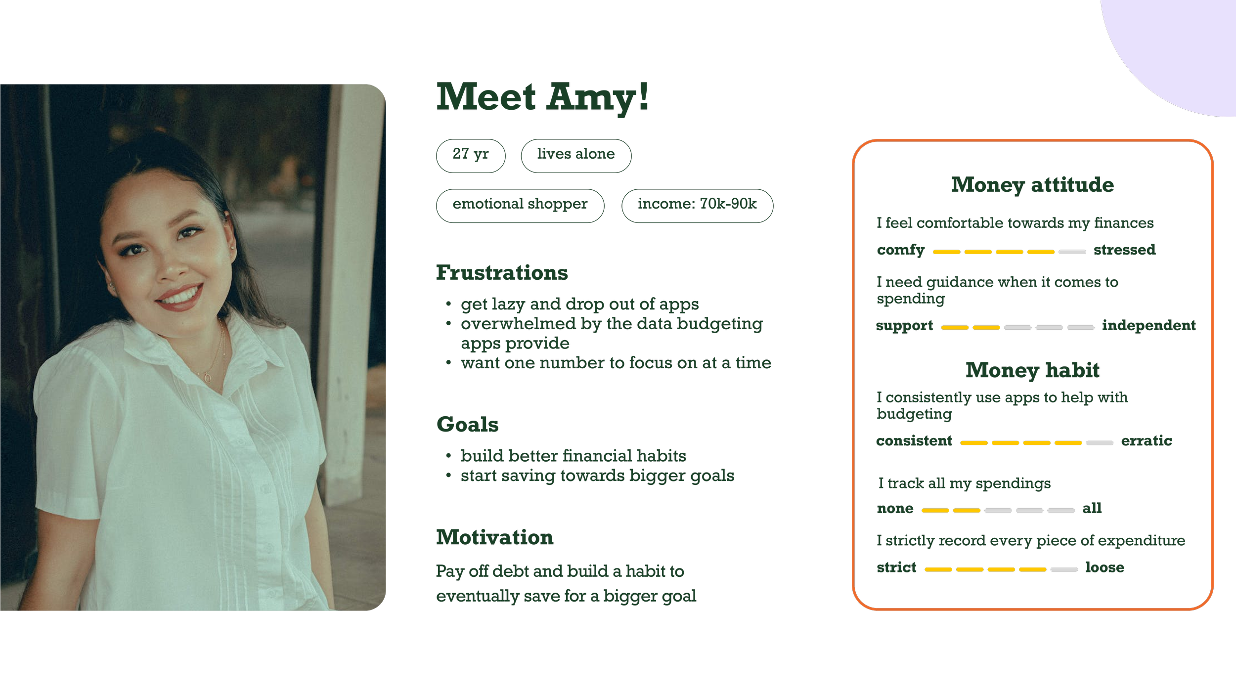
With the research highlights mentioned above, I created a user persona for this project.
Let’s meet Amy, who is in her late 20s, lives alone, and manages her finances independently. She is aware of her financial situation but doesn’t follow a strict budget. She wants to start building better financial habits in order to start saving for bigger goals in the future.
COMPETITIVE RESEARCH
valuable insights into existing solutions and inspiration for the design
Having defined a user persona for the challenge, I turned to the existing market to find valuable insights from the current solutions that aim to tackle similar challenges.
There is a wide range of products offered in today’s market to help users stay on track with their finances. I chose the following products for my analysis:
Mint by Intuit
Rocket Money
YNAB
TrackMySubs
Among these apps, TrackMySubs caught my attention because compared to other conventional financial/budgeting tools, it has only one focus: track users’ subscriptions. I find this an interesting approach: when every other app tries to make users do many things at a time, it doesn’t try to overwhelm users but instead helps users stay focused on one aspect first.
There are many tools out there similar to the ones included in the analysis. Additionally, there are tens of thousands of videos and social media posts online teaching people how to optimize their financial goals with these tools. Despite this abundance of resources, the users I have identified – the 'Amys' – are dropping out of these services and products, feeling overwhelmed with all the information and still stressed about their financial habits.
So, what is missing for them? Why isn’t this working?
WHITE PAPER RESEARCH
a deeper dive into the challenge space
To tackle this question, I delved into further research on the psychology of money, aiming to grasp its foundations better.
“We see our future self as a stranger, and it’s hard to save money for a stranger. Researchers from New York University found that when subjects had a clearer vision of what their “future self” looked like, they saved more money. ”
This key finding shows that saving money is a mental game. The more people are able to visualize their goals, the more likely they are to achieve their savings goals. This discovery is pivotal for my research phase, inspiring me to conduct a second round of competitive research to analyze existing products that work with people’s psychology.
COMPETITIVE RESEARCH ROUND 2
Budgeting is often compared to dieting, as both require individuals to have the mental strength to see long-term benefits. My first instinct for the second round of competitive analysis was to search for fitness goals or dieting products. Following this logic, I expanded the scope to include general goal-setting products and those designed to help people stay focused and task-oriented.
As I conducted my research, I noticed that many of these products are either somewhat or fully gamified. I chose to analyze fully gamified products because I observed a gap in the financial tool market—there is currently no fully gamified financial planning tool available.
The products I analyzed are the following:
Carrot Fitness: a simple fitness application designed to help users reach their ideal weight goal with a snarky tone
Finch: a gamified mobile application designed to help users complete all their daily tasks and stay on track with users’ daily tasks
Flora: a focusing application that helps users stay focused
Define
Here in the define phase, I use the comprehensive insights gained from the discovery phase to identify 3 user stories and the user flow for the project.
USER STORIES
As a user, I want to….
…be able to set a financial goal and achieve it
...make sure that I stay on track of my goal and be held accountable
...focus on one simple goal
USER FLOW
Ideate
I began the ideation phase by asking myself the following questions and connecting the dots from the key research findings in the discovery phase.
Some of the questions that I considered carefully before the initial design of wireframes:
Do users save directly in the app or is this an accompanying app?
How to gamify the savings journey?
Should users customize and to what degree?
What would the reward and punishment system look like?
What kind of tone should the narrative take?
WIREFRAMING
I came up with answers to these questions with my initial wireframe designs. I then tested the design with 7 users to validate my preliminary solution.
I chose the direction of a savings companion design idea, where users would not save directly in the application. Users would be able to set a goal by naming it, specifying the goal amount, selecting the desired deposit frequency, and setting an end date. The user would then move on to choose an avatar (the savings companion) to accompany them on their savings journey. They would check-in at the frequency set previously until their goal is achieved.
After testing the initial design, users generally liked the idea but were confused about the following 2 issues listed below. In order to address the confusion, I made a significant pivot in both the design and the narrative.
Who is Hero?
The testing narrative is very vacation-focused, but what happens if I am saving for a different goal?
WHO IS HERO?
During testing, a question arose multiple times. While users understood the concept of choosing an avatar, they found the superhero coin in the logo and the human-like avatars confusing. They wondered which one was the Hero that would accompany them on this journey.
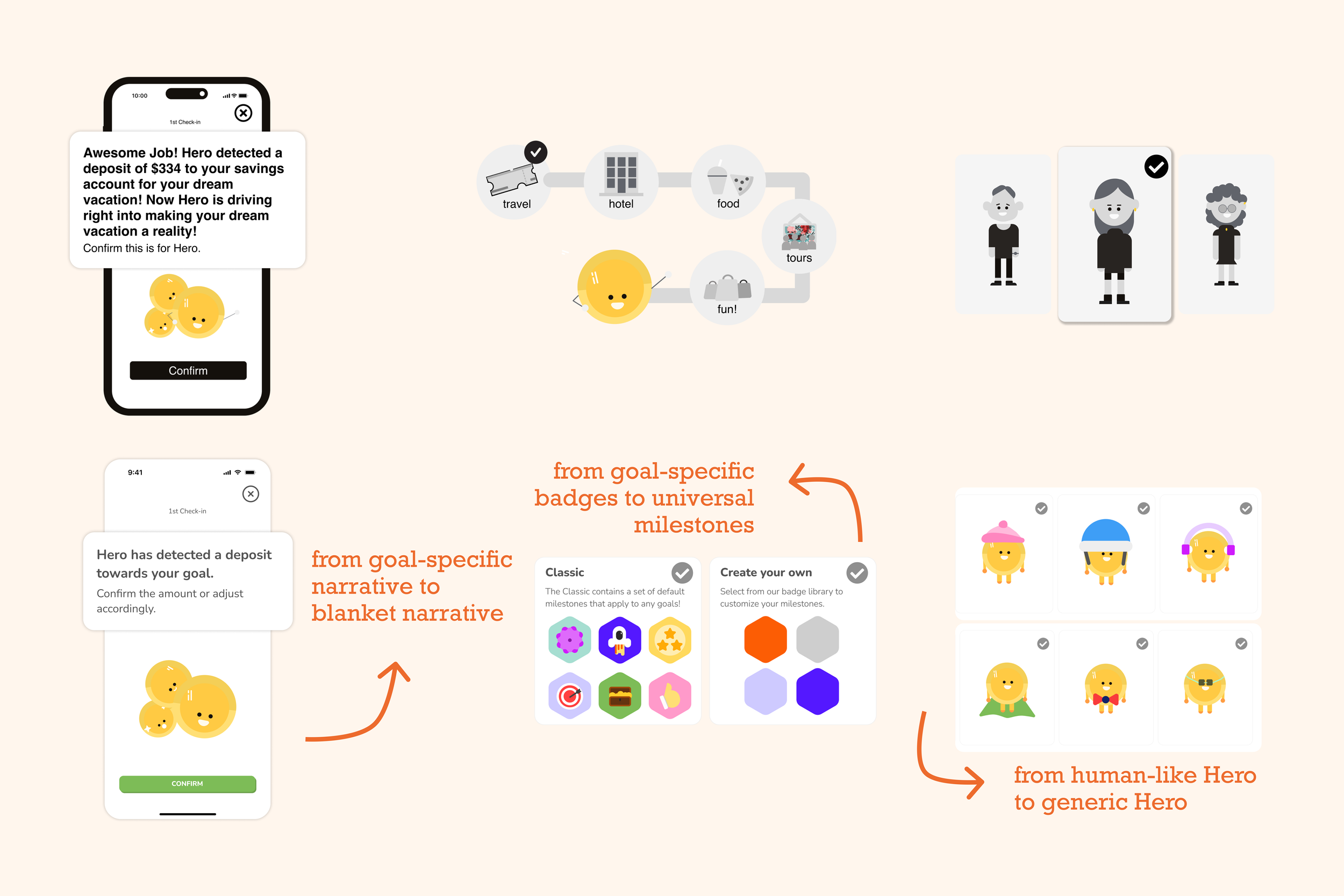
To address this confusion, I streamlined both the branding and the customization narrative as shown below.
SCALABILITY
I had a very vacation-specific testing script and design. This will not resonate with the average user, as they don't intend to download a savings application solely for saving towards vacations. The second question they asked essentially pertains to scalability: what happens when users want to save towards a different goal?
I approached this scalability issue from 3 different angles:
Narrative
Milestone design
Hero design
Iterate
Having resolved these two major challenges, I dove full force into designing the high-fidelity screens. I conducted another round of usability testing and made the following adjustments based on the most critiqued areas in the high-fidelity screen iteration phase.
Added onboarding animation before goal-setting
Clarified badge selection requirements
Added road map feature
USER FEEDBACK ON HI-FI SCREENS
RESULTS
“I think you have really found your niche with pocket hero...I would definitely use this if it were to be launched.”
“Pocket hero really makes saving simple. I love that it calculates the one number for my goal.”
“I love the fact that it gives you different options for when you don’t have the expected amount. It supports you throughout the journey.”
THE REFLECTION
Next steps
If I were to take Pocket Hero to the next step, here are the questions that I would consider:
What would push notifications be like to users?
For automatic deposits, what if the user’s fund is low?
What would the experience be like if users wanted to save with a partner or friends?
How to better celebrate users' achievement after they reach a longer-term and harder goal?
Learnings and highlights
Before Pocket Hero, I had never imagined I could illustrate an entire product by myself. I don’t come from a graphic design background, but I found my way to learn and gather inspiration for Pocket Hero. I analyzed the types of designs gamified applications use and observed people playing games to understand important patterns of why games are so engaging, keeping players coming back for more. I also studied how gamified apps communicate with users and experimented with different tones in Pocket Hero.
I learned that even though the concept isn't complicated—save, earn badges, and mission accomplished—the most challenging part is to define the brand identity and narrative: Do they make sense? Can we scale up?
Finally, Pocket Hero also taught me that when I become too fixated on one narrative, I need to take a step back to not lose sight of the big picture. I learned to create a narrative and product concept that would be welcoming to everyone.


